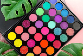
The role of your color palette in creating a brand identity is often understated. According to research, 85% of consumers think that color is the biggest motivator when choosing a product. 92% feel that visual appearance is the most persuasive marketing factor. Use the right colors when you create your logo or graphic design. Adding color to other brand identity elements won't cost you anything. Keep the following in mind when trying to find the perfect color palette for your brand;
Use a Limited Palette
Finding the perfect brand color is only possible when people can recognize your color palette. If you add color with no restraint, you may only confuse your customers. It also dilutes the power of your main brand color. Your color palette should have only one or two colors.
Having fewer colors maximizes the impact. A color palette with lots of colors may be difficult to recognize or remember.
Understand Your Focus
What message would be important to your target audience? Use your colors to convey that message. You must have a clear idea about your goals and the type of emotions you intend to evoke. If, for example, you wish to give off an impression of being vibrant or strong, red may be the perfect color.
Psychological Impact
Think of the psychological impact that colors may have on your target clients. Blue, for example, is a symbol of trust and intelligence. Different colors may evoke different feelings and reactions. Purple is the color of creativity, green is the color of nurturing and healing, yellow is the color of happiness, and black represents sophistication.
Tips for Creating a Distinct Color Palette
1. Gather Inspiration
The first step of the process is getting inspiration. Even though you may have a few ideas in mind, it helps to seek inspiration. Try to find other brands that incorporate your favorite choices and the type of graphic design they used. If you don't have any colors in mind, ask for suggestions from other people or design sites.
2. Check Out the Competition
Take a look at the color schemes, graphics, and logos of your competitors. The information may help you create a logo or choose color schemes that compete effectively.
3. Create a Mood Board
Creating a mood board is a great way to experiment with color palettes before making a decision. There are plenty of color palette tools that may help you. You may use images and colors from other brands. When you place your idea colors close to each other, it is easy to get an impression of the emotions that they may evoke. When creating a mood board, use a palette of three colors. Designers recommend that you use the 60-30-10 rule.
4. Experiment and Have Fun
Before picking the right color palette for your brand, you should experiment with as many options as possible. Have fun and observe the impact of different colors on customers. You don't have to get it right on the first attempt. Even though it is an important decision for your brand, you should have as much fun with it as possible.
5. Choose Two Main Colors
Once you have identified what the competitors are using, it is time to narrow down your choices. Choose two main colors and focus on them. Our colors should be similar in tone. If one of them is too bright, it may overpower the other one. It is okay to work with contrasting colors if you have the help of a professional designer.
Once you have your main colors, you should find an accent tone that complements them. Your accent color should stand out. It may be brighter or darker than the main colors.
The accent color can be very useful in drawing attention away from your page. It is great for use in calls to action.
With the proper use of color palettes, it is easy to make your brand stand out from competitors. Color plays a bigger role in marketing than most people know. It is one of the most important things when you are trying to create a good first impression. Think about it when you create your logo and other brand identity elements.


